Devlog: first portfolio update - v2.1.0
9/12/2025
How’s it going?
It’s going well, thank you! I did a bit more portfolio site work today, really just porting over the last bits of what I originally had in my portfolio for the full release of v2.1.0.
wait how did u go from 0.1.0 to 2.1.0 how do ur version numbers work
I realized I probably should’ve just named the last one v2.0.0 but I was fully missing a page and I don’t think it’s good enough for me to go public on LinkedIn or something yet and I never gave any thought to it. Then I realized that having a nice naming convention will give me dopamine hits whenever I make a patch, so then I can gaslight myself into continuing work on this site.
The normal convention is major.minor.patch. Technically, my last portfolio was v1.0.0 so this revamp is a major patch to v2.0.0, and then these changes (which I’ll go through) are a minor update. There will be “big” patches in the future, but I don’t plan on a revamp and conceptual change for a while, so I don’t think we’ll have a v3any time soon. Think like Minecraft, ya know?
portfolio changes
Thankfully, I’ll finally get some regularity and structure with these portfolio updates. Instead of wild musings about things I learned, I can just do patch changes and additions:
- added about section
- added icons to the carousel
- added landing page animations
the about section
Going down the list, I connected the about section up:
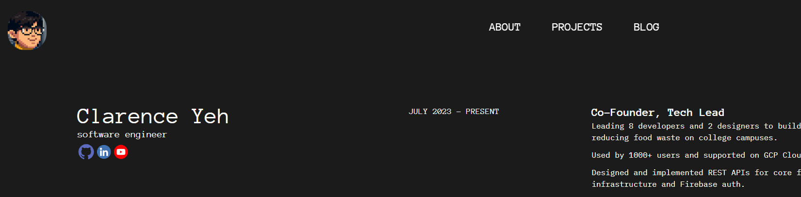
Okay, it’s basically just my resume right now, but I’ll think of something more fun to add in a bit, okay? :D
icons
I finally added my tech stack icons back to my project cards!
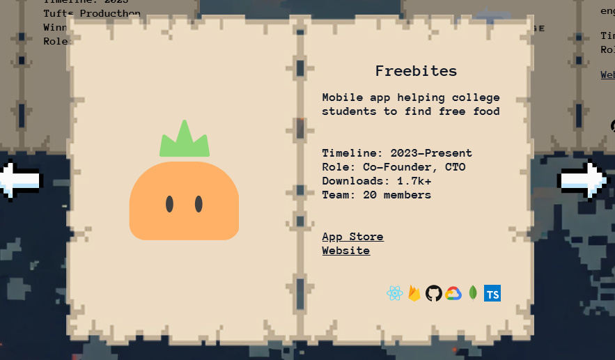
My icons weren’t in the original release, because I was originally using astro-icons, but since my icons were in my carousel, which is a react carousel due to needing javascript to interact with it, i can’t use astro-icons. However, I didn’t know any way to import dynamically - astro-icons lets me just put in an icon name like github and it’ll import the github logo according to the file I put in my src/icons folder.
I could’ve added a map of all the icons, but that would make adding new icons more tedious. Then I found out about lazy loading from React!
import { lazy, Suspense } from "react";

interface TechStackIconProps {
  name: string;
  size?: number;
  altStyle?: string;
}
export default function TechStackIcon({
  name,
  size = 24,
  altStyle,
}: TechStackIconProps) {
  const IconComponent = lazy(() => import(`../../icons/${name}.svg?react`));
  return (
    <Suspense fallback={<span />}>
      <IconComponent width={size} height={size} className={altStyle} />
    </Suspense>
  );
}
And to use it, I just need to pass it in the name of whatever icon I want to import like so:
<div
className={`absolute flex ${
background
? "bottom-16 right-12 gap-1"
: "bottom-24 right-12 gap-1"
} `}
>
{project.techStack.map((icon) => (
<TechStackIcon
name={icon}
size={background ? 20 : 24}
altStyle={background ? "brightness-60" : ""}
/>
))}
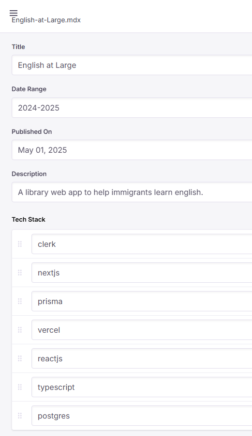
</div>project.techStack is actually grabbed from the metadata of projects, and I create through the TinaCMS editor when I create them (see why they’re useful? I write about them here). I define the types in both content.config from Astro, as well as tina’s config file so the fields show up in the editor like this:
Maybe I’ll make a separate blog post about exactly how everything is hooked up so other people can follow along!
landing animations
I’m using framer-motion for animations, and I decided to manually do a little stagger effect to really sell it:
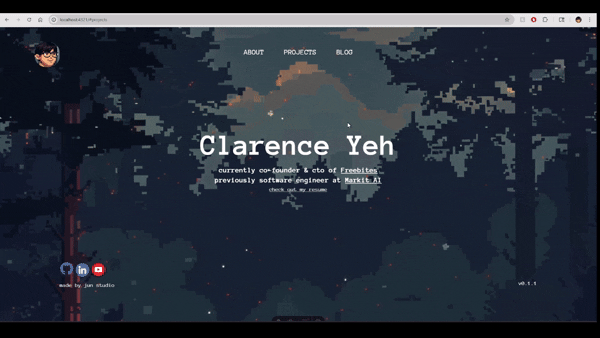
I just really like stagger effects and it’s really easy to add them in framer motion, so I’m glad it didn’t take that long. That’s all for now!