Devlog: changing freebites color palette
9/17/2025
What’s the task for today?
Today, Owen and I met up to work on Freebites. But instead of the website, our task was on the mobile app!
What happened?
Our lovely designers decided to finalize and switch out our color palette to a brighter one (I don’t know anything about color), as well standardizing our spacing guidelines.
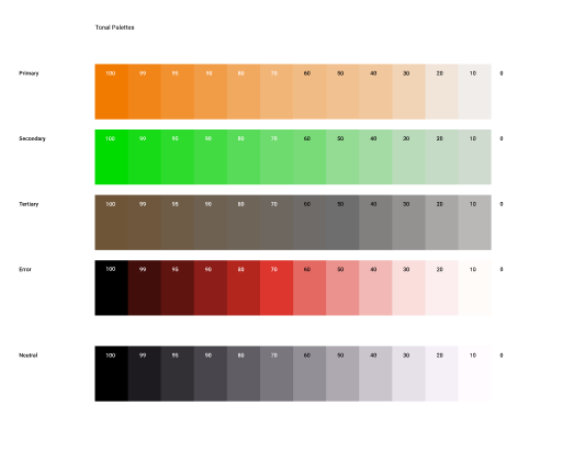 Above is our old color palette
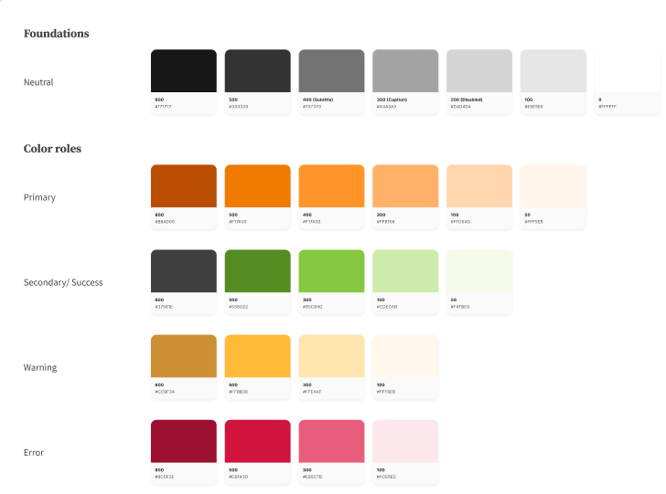 And above is our new one!
We simplified a lot of the colors down, and I think it looks a lot better once you put them side by side:
Old on the left, new on the right!
Should be quick, right?
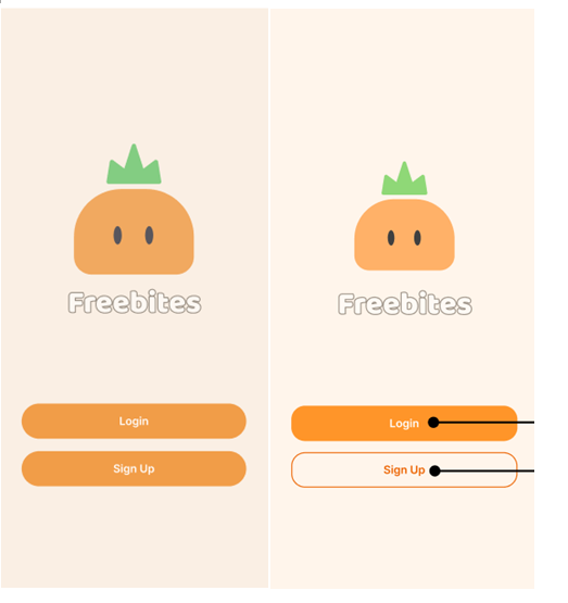
So actually, even though we DID put our colors in a theme.ts file, the naming conventions are different than how we have it currently structured - and some things swapped colors (see how sign in is different now)? We also didn’t adhere to using the COLORS object correctly, so some colors are defined inline, which means, we’ll need to swap them out too.
So now we’re going to (and for the last time) manually go through and swap them out, placing them into a new colors (and final!) COLORS object.
const NEWCOLORS = {
  neutral: {
    /** Whatever the darkest text is lol */
    600: "#171717",

    /** Main body text */
    500: "#404040",

    /** Subtitle */
    400: "#737373",

    /** Caption */
    300: "#A3A3A3",

    /** Disabled  */
    200: "#D4D4D4",

    /** Border */
    100: "#E5E5E5",

    /** Background */
    0: "#FFFFFF",
  },
And so on and so forth.
How’s it going so far?
Well, we took four hours to get through about 80 files, but I’d say we’re like 20-25% done. We’re almost done swapping out all the colors, but the other thing is to swap out the spacing, which is a bit of a monster. The other other thing is that we’re also going to be standardizing our spacing and text styling. This will have the other impact of clearing out our StyleSheets, which currently look like this:
const styles = StyleSheet.create({
  postContainer: {
    rowGap: screenHeight * 0.028,
    paddingBottom: screenHeight * 0.014,
  },
  skeletonContainer: {
    rowGap: screenHeight * 0.028,
    paddingVertical: screenHeight * 0.014,
  },
  textTitle: {
    fontWeight: "bold",
    fontSize: 24,
    color: "#505A4E",
    textShadowRadius: 1,
    textShadowColor: "black",
    paddingBottom: 12,
  },
  textContainer: {
    margin: "5%",
    width: "65%",
    alignItems: "center",
    justifyContent: "center",
    flex: 1,
  },
  textBody: {
    textAlign: "center",
    color: "#505A4E",
    opacity: 0.57,
  },
  adminTitleContainer: {
    height: 100,
    width: "100%",
    paddingTop: 60,
    paddingHorizontal: 20,
    flexDirection: "row",
    justifyContent: "space-between",
    alignItems: "center",
  },
  adminTitleText: {
    color: NEWCOLORS.neutral[500],
    fontSize: 32,
    fontWeight: "bold",
    textAlign: "left",
},
});
Things like textBody and textTitle are repeating styles across multiple pages, so we can just fold them into our GLOBALS constant and use them directly, which would drastically shorten the stylesheet and make adjusting styles a lot easier.
Lots of work done, but a lot ahead of us!
Additionally, we noticed that there were some new designs that had no plans of being implemented yet, so we decided to just do them while we’re there anyway, since we’re going to have to revamp them to adjust the spacing anyway.